Projects/Virtual Engagement Manager
Virtual Engagement Manager
A self-service platform that lets pharma commercial teams plan and run engagement with healthcare professionals — designed inside an agile squad spanning UX, product, analytics and engineering.

The brief in three lines.
Pharma commercial teams needed a way to plan and run engagement programmes with healthcare professionals without depending on a specialist team for every step.
Design a self-service platform in an agile squad — wireframes, prototypes, and high-fidelity screens validated with product, analytics and engineering before every release.
A platform commercial teams could run themselves, with design and engineering staying in sync through a documented, versioned handoff process.
Engagement programmes shouldn't need a specialist to launch.
Indegene works with some of the largest names in pharma — Pfizer, Sanofi, Amgen, and Lilly among them — supporting how their commercial teams engage healthcare professionals. Historically, launching an engagement programme meant looping in a specialist team for configuration, which slowed teams down and created a bottleneck whenever demand spiked.
Virtual Engagement Manager was built to change that: give commercial teams a platform they could configure and run themselves, without losing the rigor that pharma work demands.
"Self-service only works if the platform makes the right choice the easy choice."
Working the product life cycle end to end.
Understand the product life cycle
From early concept through to production, ensuring designs were delivered on schedule and stayed aligned with what engineering could realistically ship.
Collaborate across disciplines
Worked alongside UX designers, interaction designers, product managers, analytics, and engineering in a genuinely agile environment — not a design team working in isolation.
Present to leadership for review
High-fidelity designs were regularly presented to product and leadership teams for feedback — meaning the work had to hold up under real scrutiny, not just look good in isolation.
Wireframe to production, with design thinking throughout.
The approach leaned on structured design thinking — starting from the user's actual task (configuring and launching an engagement programme) rather than the feature list. Wireframes were tested and iterated before moving to high-fidelity, and every screen was documented in Zeplin for a clean engineering handoff.
Discovery
Design thinking sessions with product
Wireframe
Structure and flow before visual polish
Prototype
Interactive flows for stakeholder review
Hi-Fi
Full visual design in Figma / Sketch
Handoff
Specs and assets documented in Zeplin
From "never used this" to "running it solo."
The journey mattered more here than almost any other project — the entire point was letting commercial teams self-serve, so every point of hesitation had to be designed out.
Discover
OrientationFirst login. Templates lower the blank-page anxiety.
Configure
Highest frictionHistorically needed a specialist. Now a guided flow.
Launch
CommitmentReview screen before going live. Nothing launches by accident.
Monitor
OngoingStatus visible without asking IT. Confidence during the run.
Review
Close the loopOutcomes summarised. Feeds the next programme.
Three ways to structure the setup flow.
The central question: how much should the platform ask up front, versus reveal progressively? Each direction traded speed against confidence differently.
Single-page form
Fast for power users, but new teams froze — too many decisions before any visible progress.
ParkedMulti-step wizard
One decision per screen, clear progress. Matched how people described planning a programme out loud.
SelectedTemplate-first picker
Great for repeat users choosing a past setup, but offered nothing for a first-time configuration.
Explored, folded into B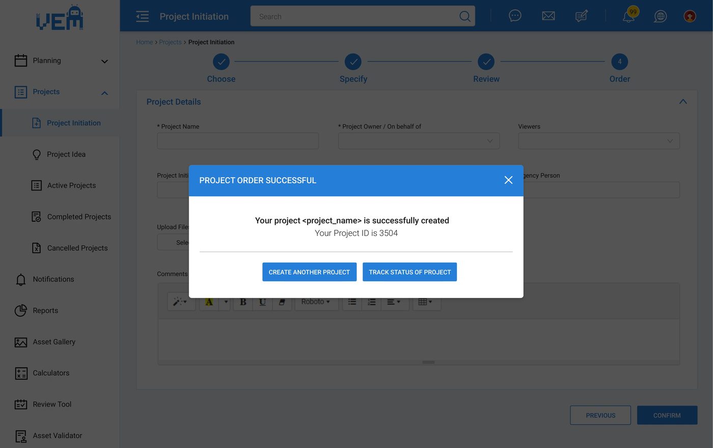
Concept B went to production as a four-step wizard — Choose, Specify, Review, Order — with a confirmation step and project ID before anything is committed.
Structure tested in grayscale before a single colour was picked.
Wireframes covered the three screens that carried the most risk — where a wrong structural call would be expensive to unwind later.
Tokens and components built for a platform, not a page.
With multiple squads shipping features in parallel, the design system was less optional polish and more the thing keeping the product coherent.
Colour tokens
Primary
Ink
Surface
Live / Success
Attention
Type scale
Component states
The platform, in production.
Actual shipped screens from the VEM design deck — spanning the home dashboard, the guided setup wizard, planning tools, and the in-context review workflow.


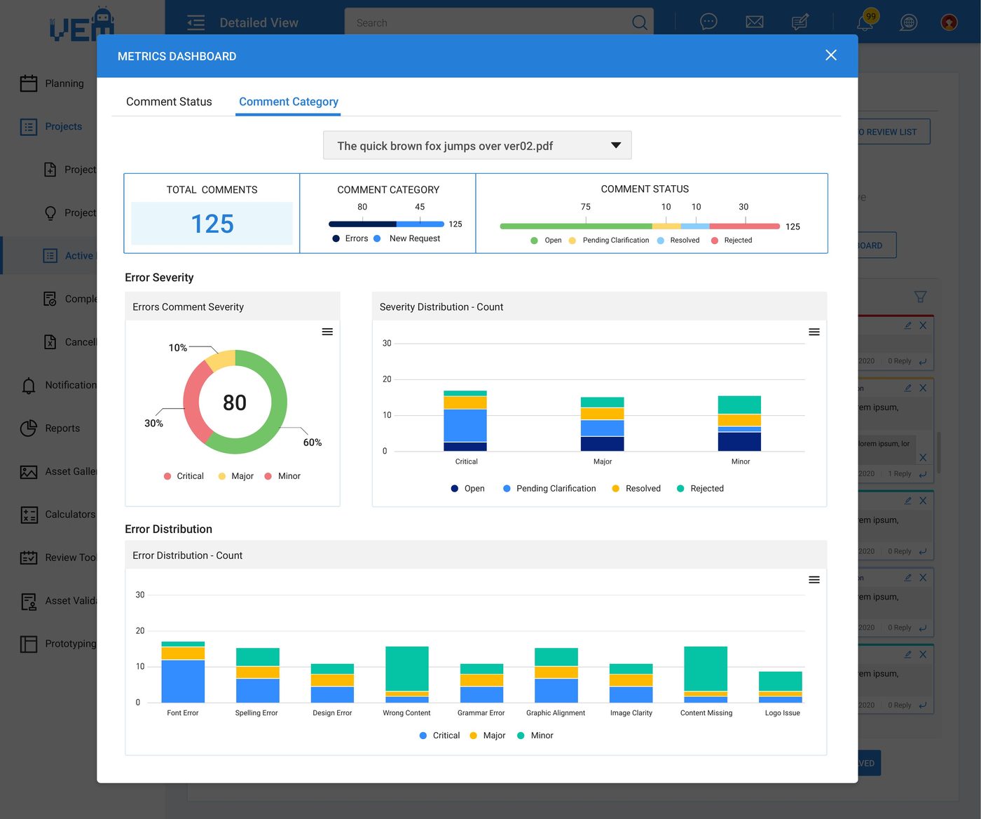
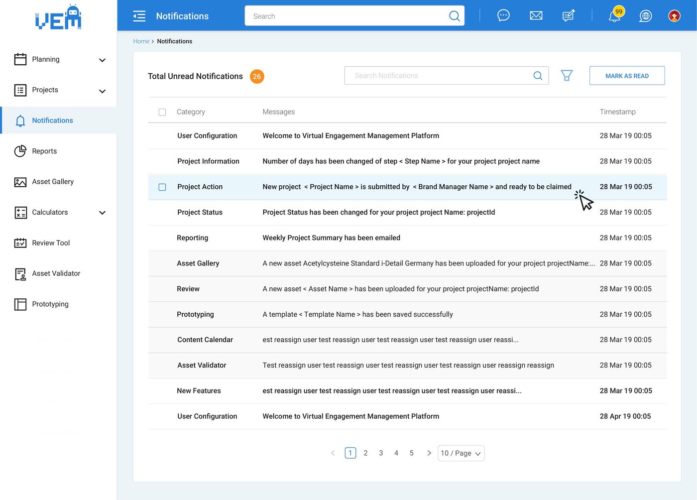
Two decisions that shaped the work.
Designing for self-service, not for the power user
The platform had to work for commercial teams who weren't technical specialists — which meant every configuration flow was designed around sensible defaults and clear guardrails, rather than exposing every possible option up front.
Treating leadership review as a design input
Because designs went in front of product and leadership regularly, the work was structured to be explainable — every screen had a clear rationale, not just a visual outcome, which made review cycles faster and decisions easier to defend.
A platform, and a working rhythm with engineering.
A self-service platform that reduced how often commercial teams needed specialist support just to launch a programme.
A documented Zeplin handoff process that kept design and engineering in sync release after release.
Interfaces built to WCAG accessibility standards throughout, not retrofitted at the end.
A design-thinking-led process that gave leadership confidence in decisions before they were built.
What this project reinforced.
Self-service is a design commitment, not a feature
Removing a specialist from the loop only works if the interface itself carries the judgement that specialist used to provide.
Cross-functional trust is built screen by screen
Working daily alongside product, analytics and engineering meant design decisions were tested against reality constantly, not just at the end of a sprint.
Regulated industries need design that can explain itself
In pharma, "it looks better" isn't a sufficient rationale — every decision needs a reason that holds up under review.